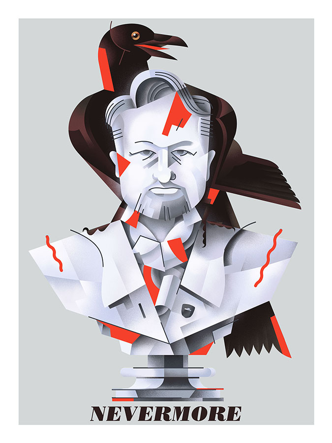
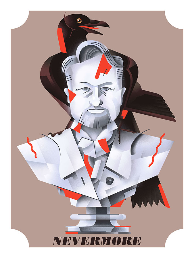
"Nevermore", a Belgian strong ale, is a beer that will be coming in 2018 from the Indie Alehouse. I'm excited about this - the beer will likely be delicious (early tastes indicate so), I was able to produce a new illustration for it (as seen above)...but most importantly, the release of Nevermore finally allows me to share this idea, and the process behind it, that has been in my brain, sketchbooks, and computers for almost 3 full years.
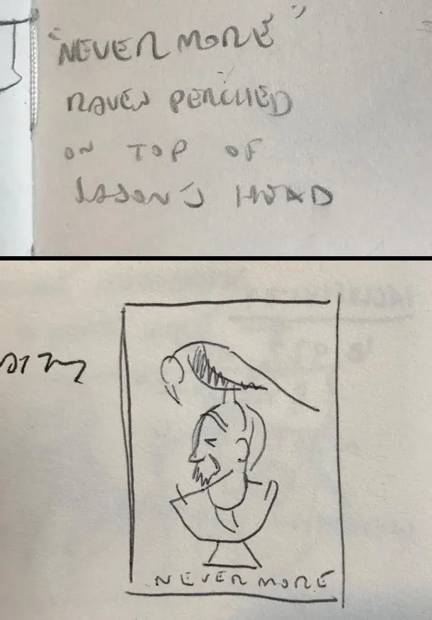
TOP: The first mention of "Nevermore", December 2014. BOTTOM: My first thumbnail, a few months later.
The first mention of "Nevermore" came in December of 2014, and was likely mentioned offhand to me as one of many names to come from a brainstorming session. It stood out immediately to me. Knowing the Edgar Allan Poe story, and the classic Simpsons halloween adaptation quite well, the image of the Indie's owner, Jason, with a raven on his head seemed too good to pass up. It would have humour, and be a nice "wink" to those more "in the know" both at the Indie, and int he Craft Beer world.
Of course, a style of beer had to be decided upon to fit the name, and thusly Nevermore went back on the shelf, for well over a year.
An updated sketch of the initial thumbnail. October 2016.
It wasn't until 2016 that Nevermore popped onto my radar - a style of beer was apparently to be determined soon, and as such, artwork should follow. Pictured above is my updated sketch from October, 2016.
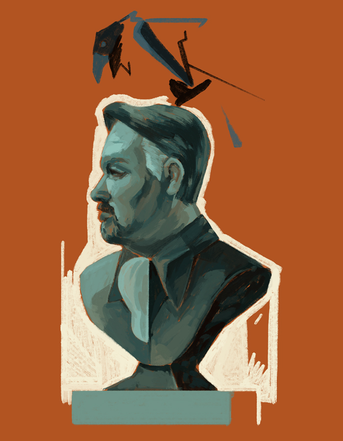
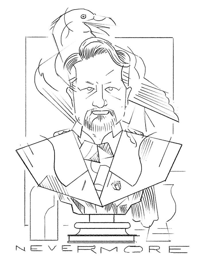
Above are further developments on the sketch - I was unsure at the time if I wanted to pursue a more painterly look, or something more in line with my usual "style".
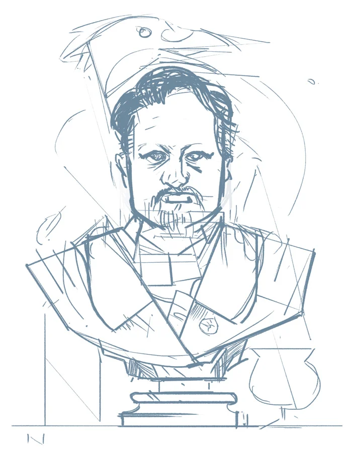
Eventually, I scrapped the profile view and set the bust facing head on, as I felt it would work better compositionally. At this stage, I was quite focussed on nailing down the likeness - the information in this sketch, and the following revision, would allow me to minimize and translate the detail into my usual flatter, graphic approach.
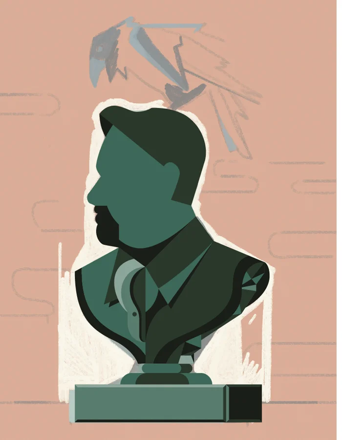
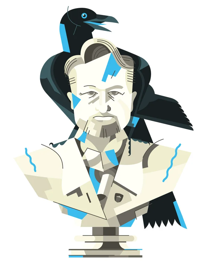
From there, it was off to Illustrator, and a few other programs.
At this stage, the shading has been applied, and the artwork placed into the final 18" x 24" file, which will later be printed. While I do enjoy hand-drawing type to go along with most of the work for the Indie, I opted to go with a readily available typeface for Nevermore, feeling that it would let the artwork stand out more. For Nevermore, I chose Bodoni Std, italicized poster weight.
Overall, I'm VERY happy with how the artwork turned out, and thus far, the prints look great. Most of all, though, I'm glad I was able to finally execute an idea that's been three years in the making.

