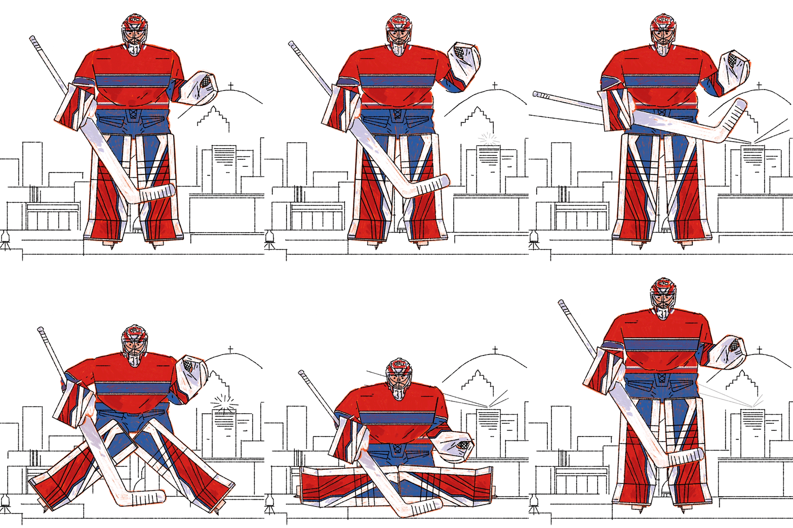
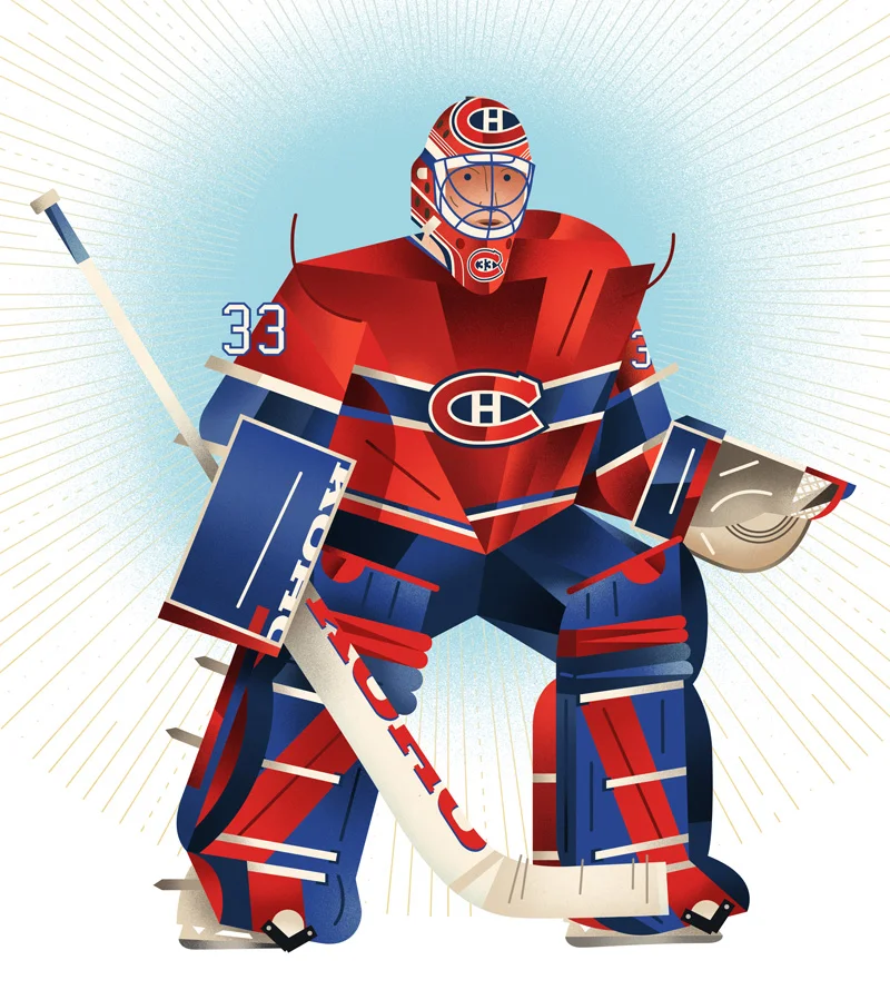
Some recent quick illustrations of some players from the first quarter of the 2018-19 NHL season. More to come, as always.
Canada Post Bees Stamp Release
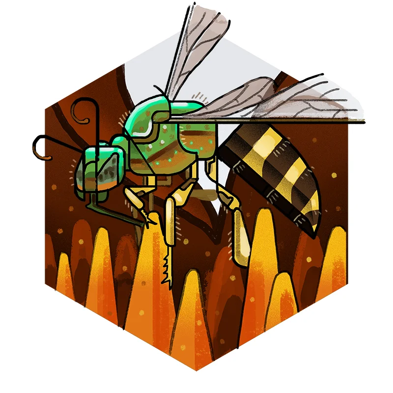
I am immensely proud to be able to finally share these: the May 2018 Canada Post "Bees" stamps, featuring my illustrations.
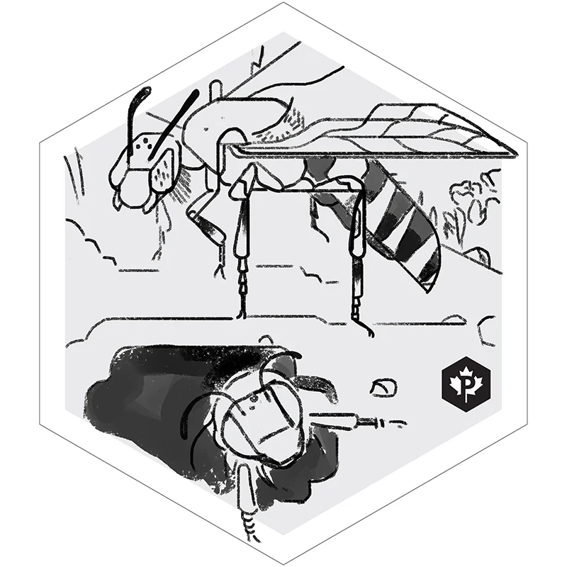
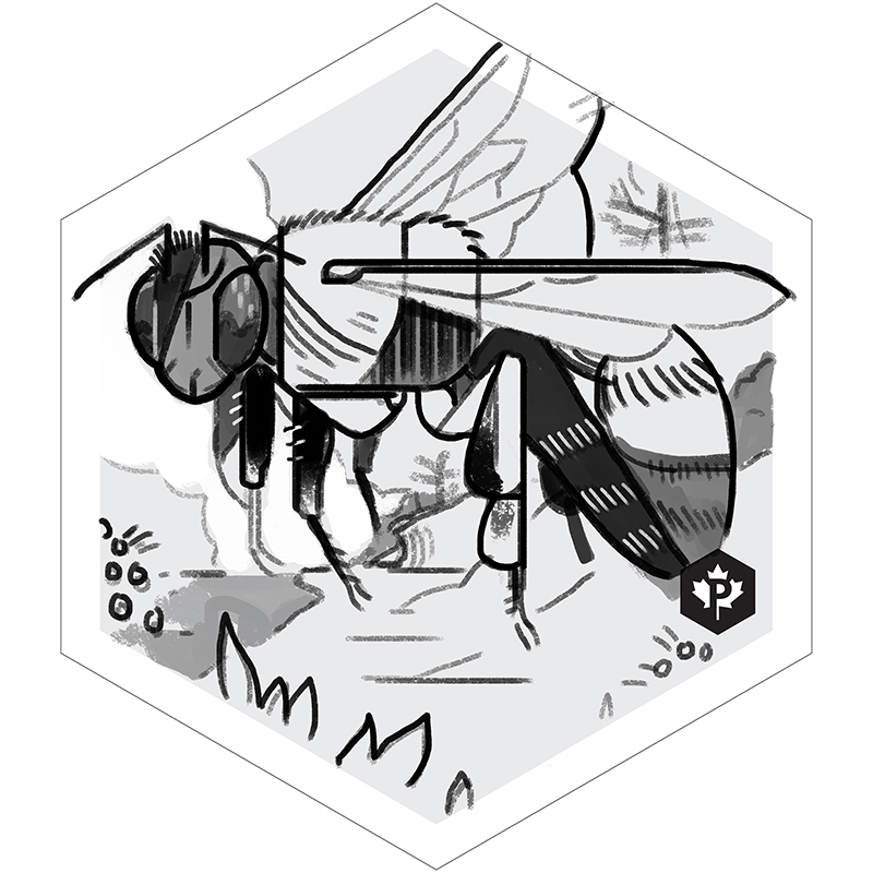
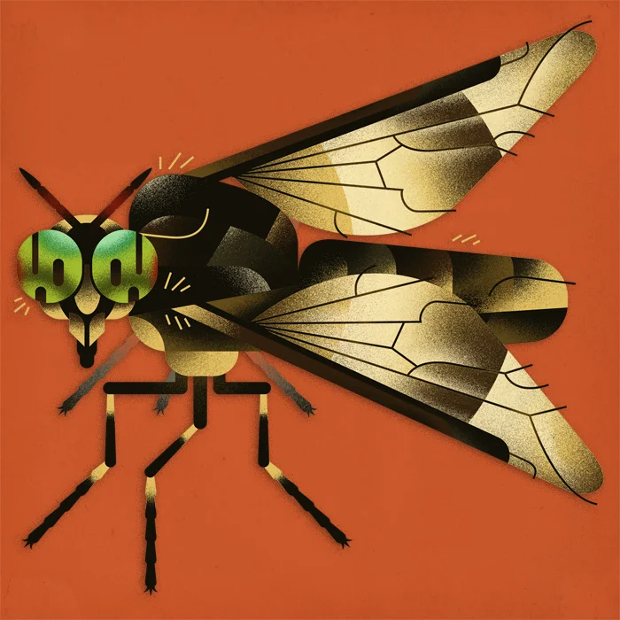
Included in the set is the Agapostemon virescens, and the Bombus Affinis, with an appearance made by the Anthidiellum notatum on the Day of Issue sheet & ink stamp.
In conjunction with designer Andrew Perro, these stamps were produced to both celebrate and heighten awareness of Canada's threatened bee population. Featured on the stamps are the endangered rusty-patched bumble bee (Bombus affinus), and the metallic green bee (Agapostemon virescenis). The rusty-patched bumble bee was the first bee species to be assessed as Endangered by the Committee on the Status of Endangered Wildlife in Canada, and has only been sighted at Pinery Provincial Park, near Grand Bend, ON since 2002.
Below are some of my development sketches - I actually have quite a familiarity with the Agapostemon, as they were a regular subterranean tenant of my parent's front yard when I was younger.
Again, I am beyond thrilled to finally be able to share these, and also very thankful to designer Andrew Perro and the folks at Canada Post for including me in such a great project.
So, if you get any mail from me in the next while, be sure to take a look at the stamp!
Nevermore, an Epic Journey
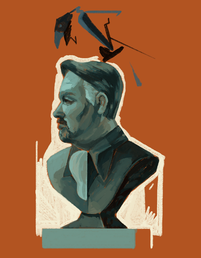
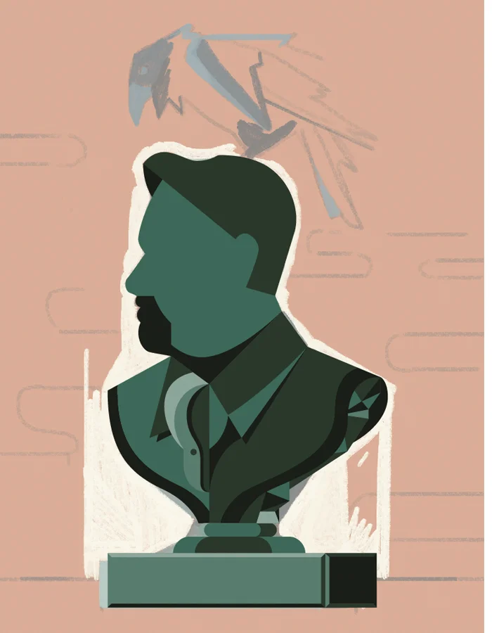
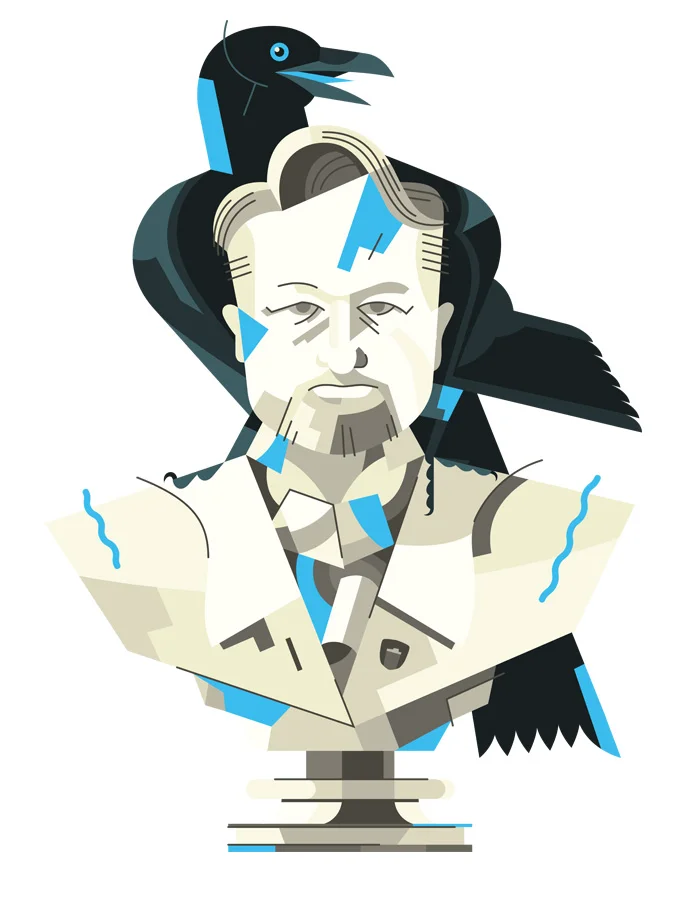
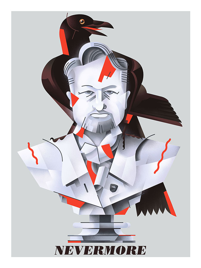
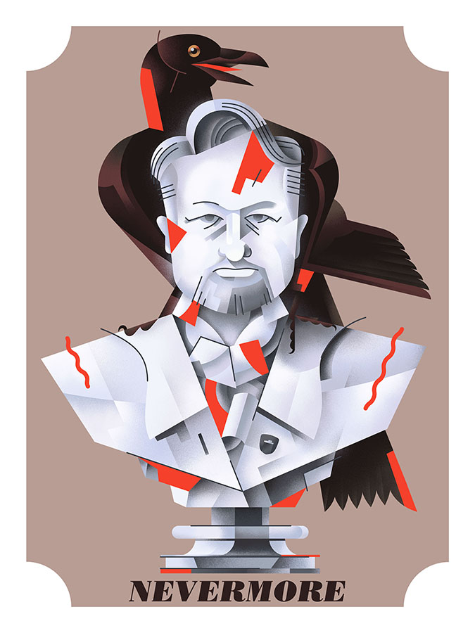
"Nevermore", a Belgian strong ale, is a beer that will be coming in 2018 from the Indie Alehouse. I'm excited about this - the beer will likely be delicious (early tastes indicate so), I was able to produce a new illustration for it (as seen above)...but most importantly, the release of Nevermore finally allows me to share this idea, and the process behind it, that has been in my brain, sketchbooks, and computers for almost 3 full years.
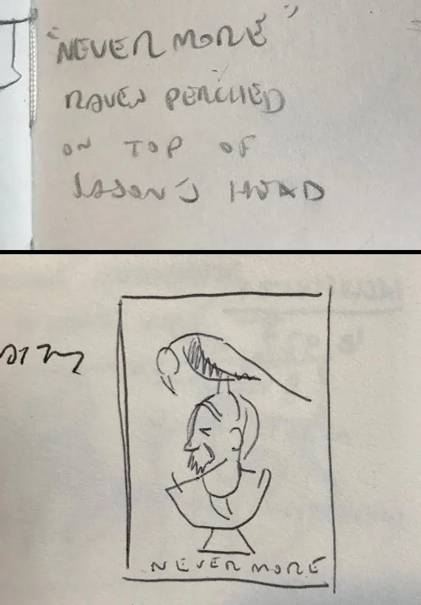
TOP: The first mention of "Nevermore", December 2014. BOTTOM: My first thumbnail, a few months later.
The first mention of "Nevermore" came in December of 2014, and was likely mentioned offhand to me as one of many names to come from a brainstorming session. It stood out immediately to me. Knowing the Edgar Allan Poe story, and the classic Simpsons halloween adaptation quite well, the image of the Indie's owner, Jason, with a raven on his head seemed too good to pass up. It would have humour, and be a nice "wink" to those more "in the know" both at the Indie, and int he Craft Beer world.
Of course, a style of beer had to be decided upon to fit the name, and thusly Nevermore went back on the shelf, for well over a year.
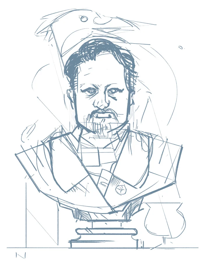
An updated sketch of the initial thumbnail. October 2016.
It wasn't until 2016 that Nevermore popped onto my radar - a style of beer was apparently to be determined soon, and as such, artwork should follow. Pictured above is my updated sketch from October, 2016.
Above are further developments on the sketch - I was unsure at the time if I wanted to pursue a more painterly look, or something more in line with my usual "style".
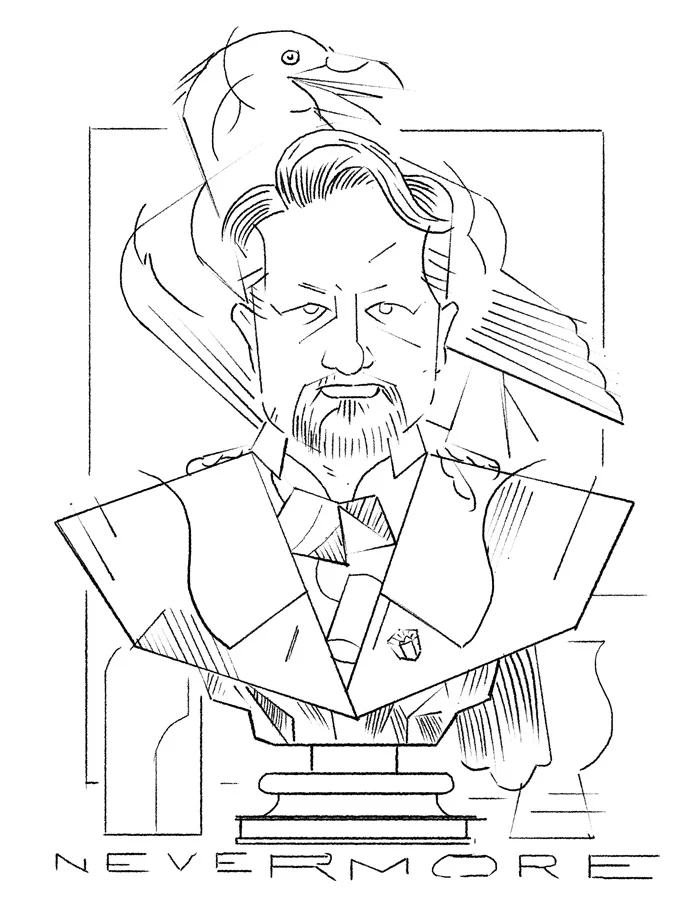
Eventually, I scrapped the profile view and set the bust facing head on, as I felt it would work better compositionally. At this stage, I was quite focussed on nailing down the likeness - the information in this sketch, and the following revision, would allow me to minimize and translate the detail into my usual flatter, graphic approach.
From there, it was off to Illustrator, and a few other programs.
At this stage, the shading has been applied, and the artwork placed into the final 18" x 24" file, which will later be printed. While I do enjoy hand-drawing type to go along with most of the work for the Indie, I opted to go with a readily available typeface for Nevermore, feeling that it would let the artwork stand out more. For Nevermore, I chose Bodoni Std, italicized poster weight.
Overall, I'm VERY happy with how the artwork turned out, and thus far, the prints look great. Most of all, though, I'm glad I was able to finally execute an idea that's been three years in the making.
Carey Price, 2017-18
As per tradition (and superstition, at this point) - an illustration of Carey Price for the upcoming 2017-18 NHL season. Go Habs Go!
Connor MECHDavid
Another fun motion graphics project, this time focussing on Connor McDavid of the Edmonton Oilers.
R2-D2
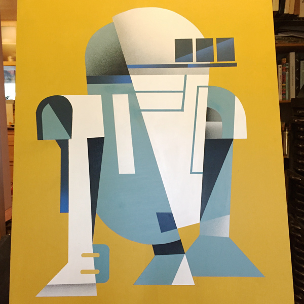
Every now and then I get around to doing a personal piece - and with all the excitement around Star Wars: Episode VII, I figured I would do a portrait of everyone's favourite astromech droid, R2-D2.
The painting itself is quite big (for me, at least) - 22 x 30 inches. It's always interesting finding ways to translate my digital style into the physical workspace; I definitely learn something new with each new piece.
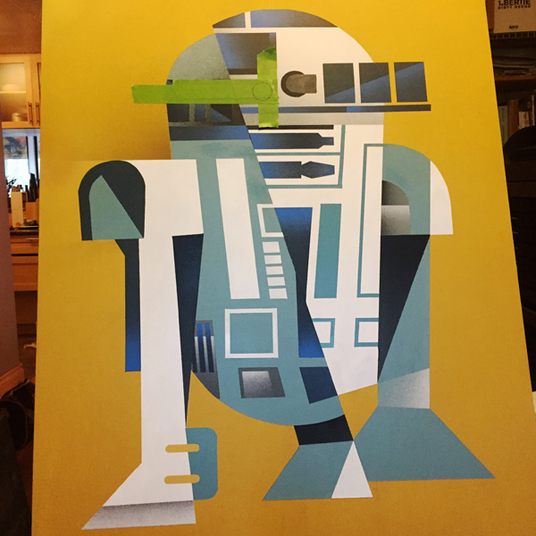
Here's some process shots - from sketch to finished piece.
The initial small drawing in my sketchbook.
The initial shapes laid down as flat colours. I actually had to sand down my first attempt at laying down the flats, as some of the paint didn't adhere properly.
Further masking and detailing - gradients are added here and there.
Getting into the final details. All of the shapes are masked and cut by hand.
Beeeeooooweeep!
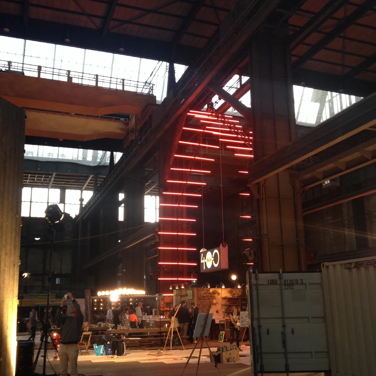
Grolsch 400
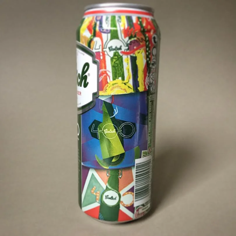
I'm very excited to finally share this - my work for Grolsch, celebrating their 400th anniversary!
It was early September when I received a call from Sarah, my contact at Grolsch - we had been in contact quite a bit over the summer, as I had completed a glassware project for Grolsch and had just completed some button and banner designs for their TIFF promotions. She asked me what my timeline was in the upcoming month or so - I had no set plans, having just come back from my honeymoon.
The team at Grolsch was apparently quite pleased with the work I had completed for them up to the point - my contribution to their glassware project and the aforementioned TIFF buttons and banners - and were wondering if I maybe had the time to go to Amsterdam, to, y'know, represent their Canadian market and contribute work to the Grolsch 400 project. I'd fly out to Amsterdam and spend 4 days seeing the sights, painting, and soaking in the amazing culture. What's more, the trip would happen in a mere 20 days or so from the phone call.
I said yes, of course.
Having never been to Europe, I was immediately excited (and, frankly, amazed) at the opportunity. To be chosen as one of 28 or so international representatives from Grolsch's worldwide markets made the opportunity to travel even better - perhaps the greatest combination of work and travel ever!
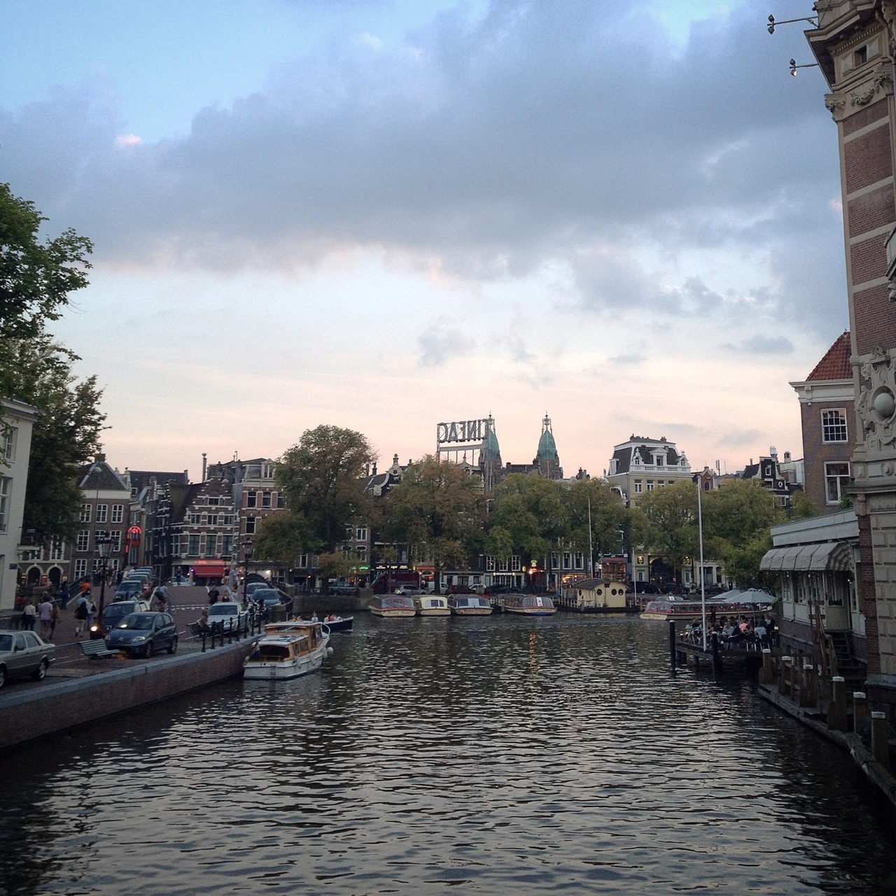
Amsterdam itself is a beautiful city. The houseboats, canals, architecture...everything there was wonderful. I spent the majority of my time there working, but did manage to take a sunny Sunday mostly to myself, biking around the city, and visiting the Anne Frank house (which was truly a moving experience).
The workspace Grolsch set up was...well, unreal. Set up in Amsterdam's North End - which used to house a massive shipbuilding industry - our collective studio was housed in a ship construction building, which is perhaps the largest single room I've ever been in.
As mentioned, I was selected as one of 28 (or so) international artists from Grolsch's markets around the world, and turned out to be the only North American. Russia, Poland, South Africa, and France were among the other countries represented, along with a large contingent from the Netherlands (obviously).
The atmosphere was something I hadn't encountered since my last year in school - a huge collection of artists, all working, talking, sharing ideas, and really having fun. It was electric.
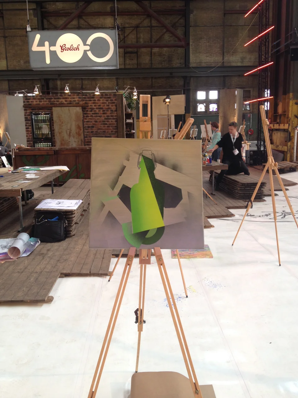
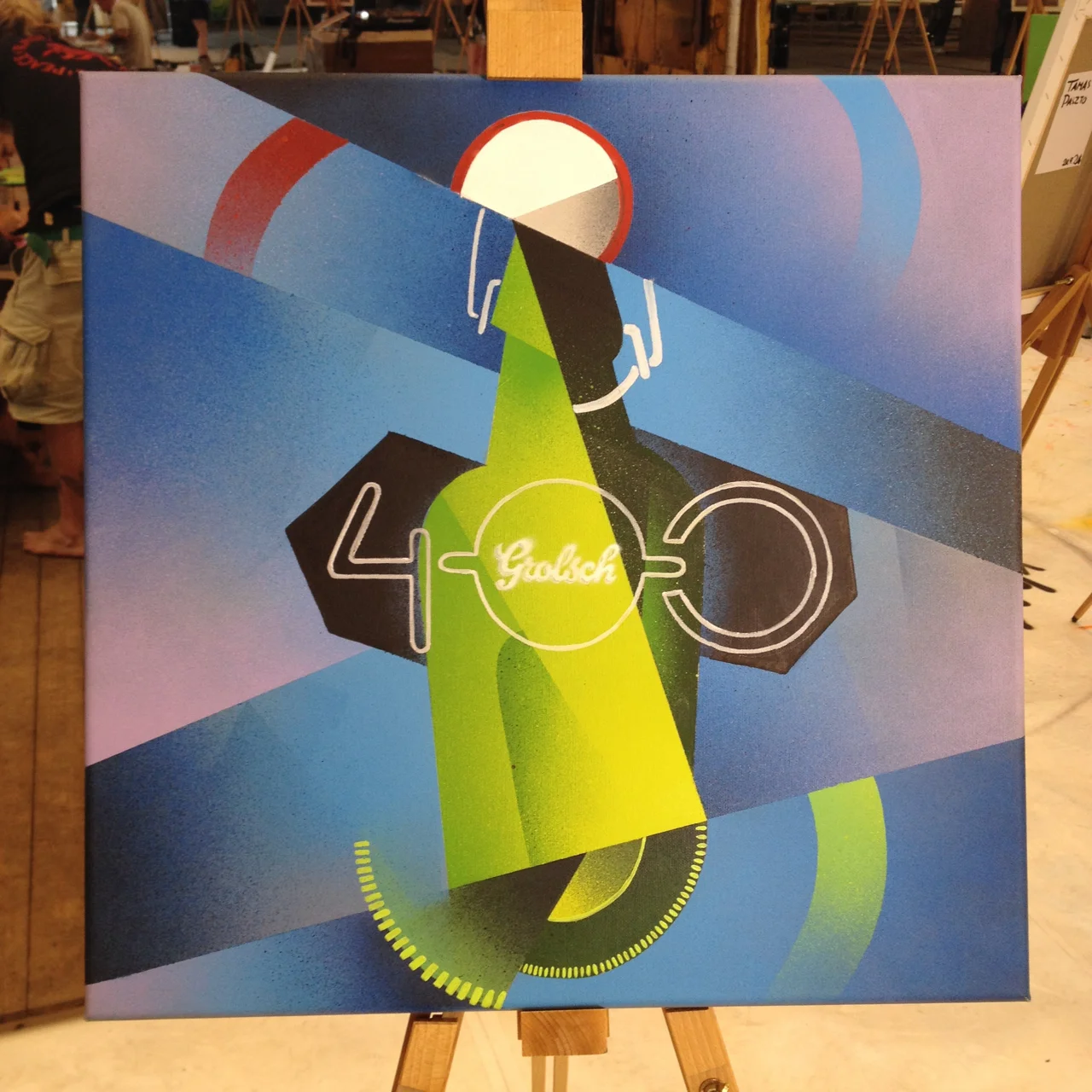
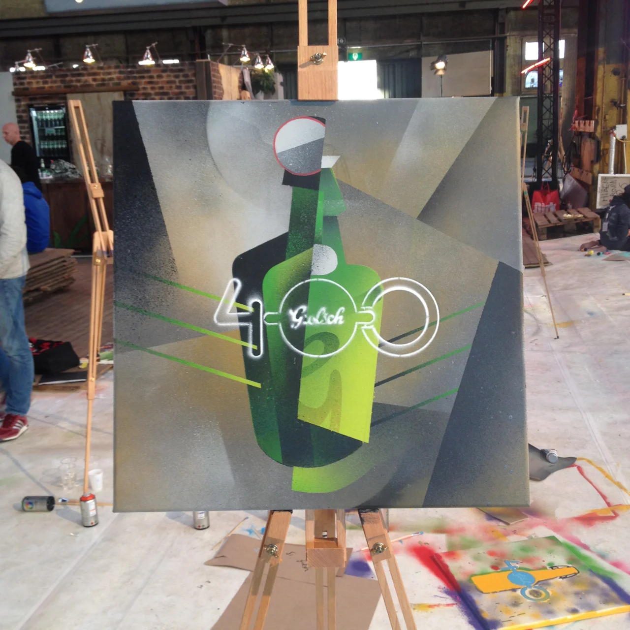
I wish I could say that I actually paint more than I do, with most of my work being digital - the Grolsch 400 project really gave me the chance to cut loose and play around with painting ina way I haven't done in years. One of the most interesting (and relieving) things was how easy, and natural, it felt translating the images in my head onto canvas, and how (surprisingly) close it was to my usual work process. Over the few days, I produced two paintings that I'm VERY happy with.
I'd be remiss if I didn't also mention the fantastic generosity of Grolsch. Aside from the amazing workspace and art supplies, they were amazing hosts - a post-painting beer tasting session introduced me to the MANY varieties of Grolsch. There are like...6 different kinds. I had no idea!
As I said, I'm very excited, and very proud to finally share this experience - it's really something I'll never forget.
Here's my video segment for Grolsch 400:
And one of the special cans being produced - my work is featured on the 500 mL can, the 330 mL cans, and the 330 mL 6 and 12 packs!
As they say in Amsterdam - Cheersch!
#33, Patrick Roy
Here's something I'm excited to share - a commissioned piece of my favourite NHL player of all time, the great Patrick Roy. Aside from my dad, he's the main reason I started playing goalie as a kid (and still play). One of my first memories of watching hockey was the 1993 Stanley Cup finals - seeing Roy wink at Sandstrom, I knew that playing in net was what I wanted to do.
As a small bonus, too, here's a tattoo I got a few months ago, commemorating that very wink.
GO HABS GO!
Summer!
Hope everyone is having a good summer. Remember to wear bug spray.
365 Days of Type
Harry Dean Stanton
"Look at those assholes, ordinary fucking people. I hate 'em."
- Bud, 'Repo Man' (1984)
A classic line from a classic movie - if you haven't seen Repo Man, I'd recommend it. Anyways, here's a portrait of Harry Dean Stanton, just because.


